
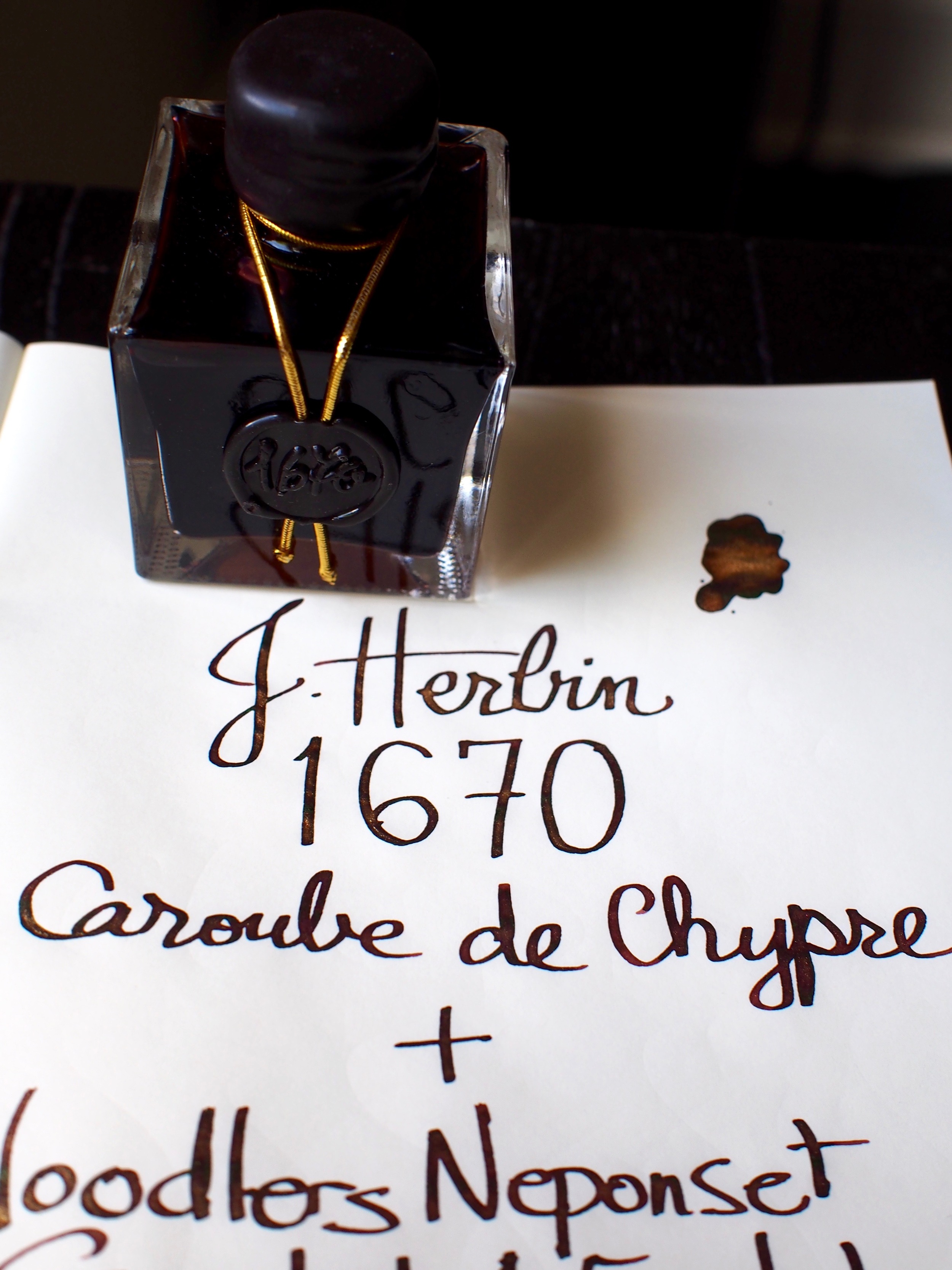
Ink Review: J. Herbin 1670 Caroube de Chypre
The latest ink from the J. Herbin 1670 collection was released last week to much fanfare. I managed to snag a bottle from from Wonder Pens and they had it on my doorstep within a couple days. It made for a fun weekend of playing around with glittery ink.
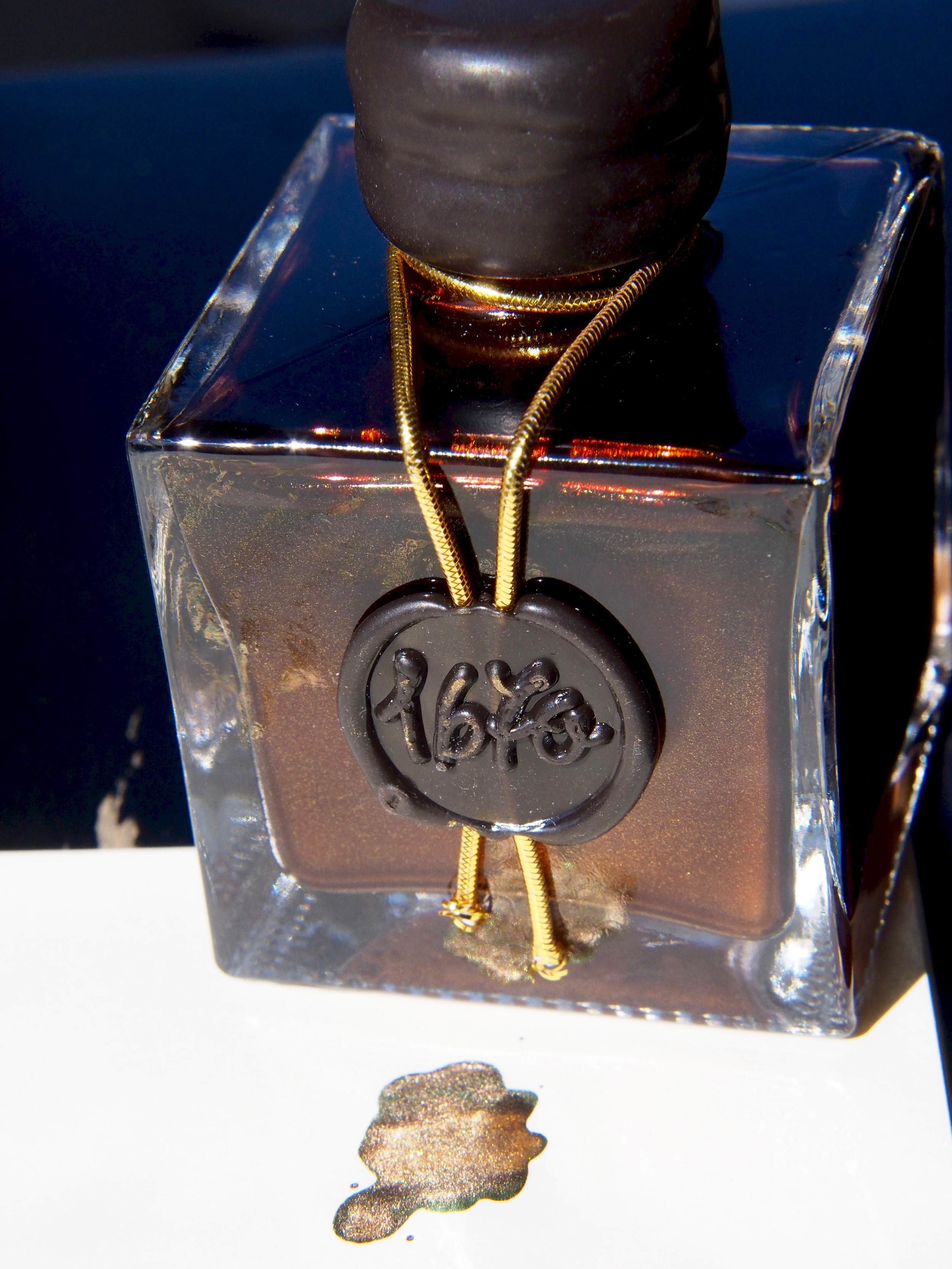
Caroube de Chypre (Cyprus Carob) is a deep brown ink inspired by the carob pods that founder J. Herbin traded for at the ports in Cyprus during his sailing voyages in the 1700's.
Handwritten Review
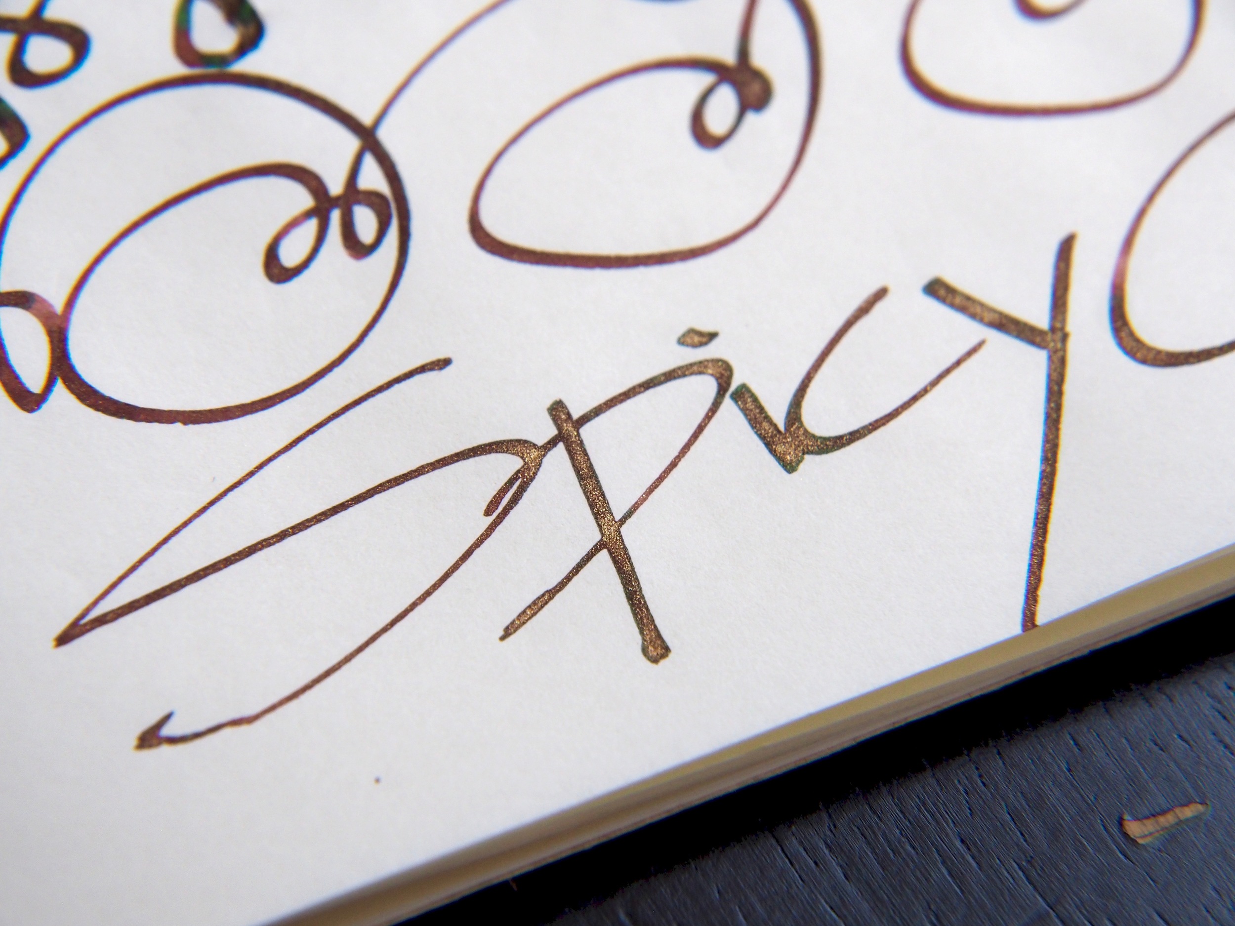
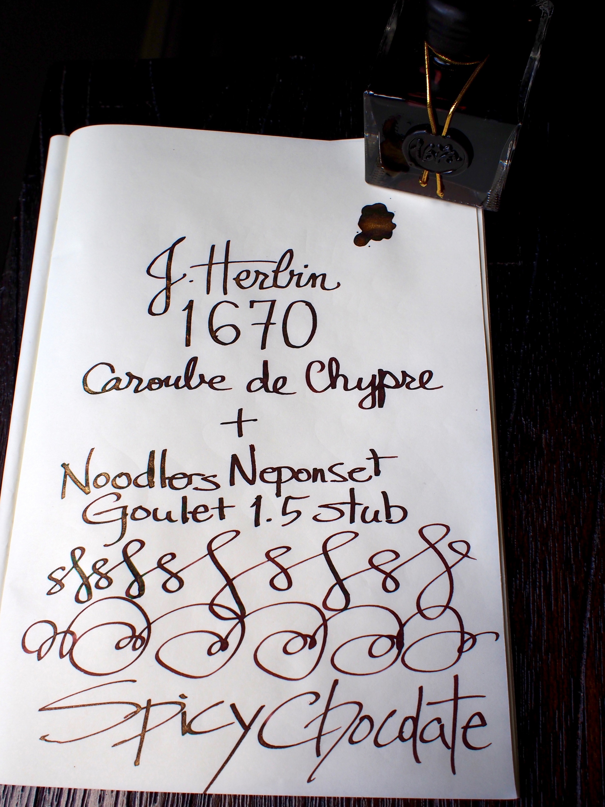
Pen: Noodlers Neponset Goulet 1.5
Ink: J. Herbin Caroube de Chypre
Paper: Rhodia No. 16
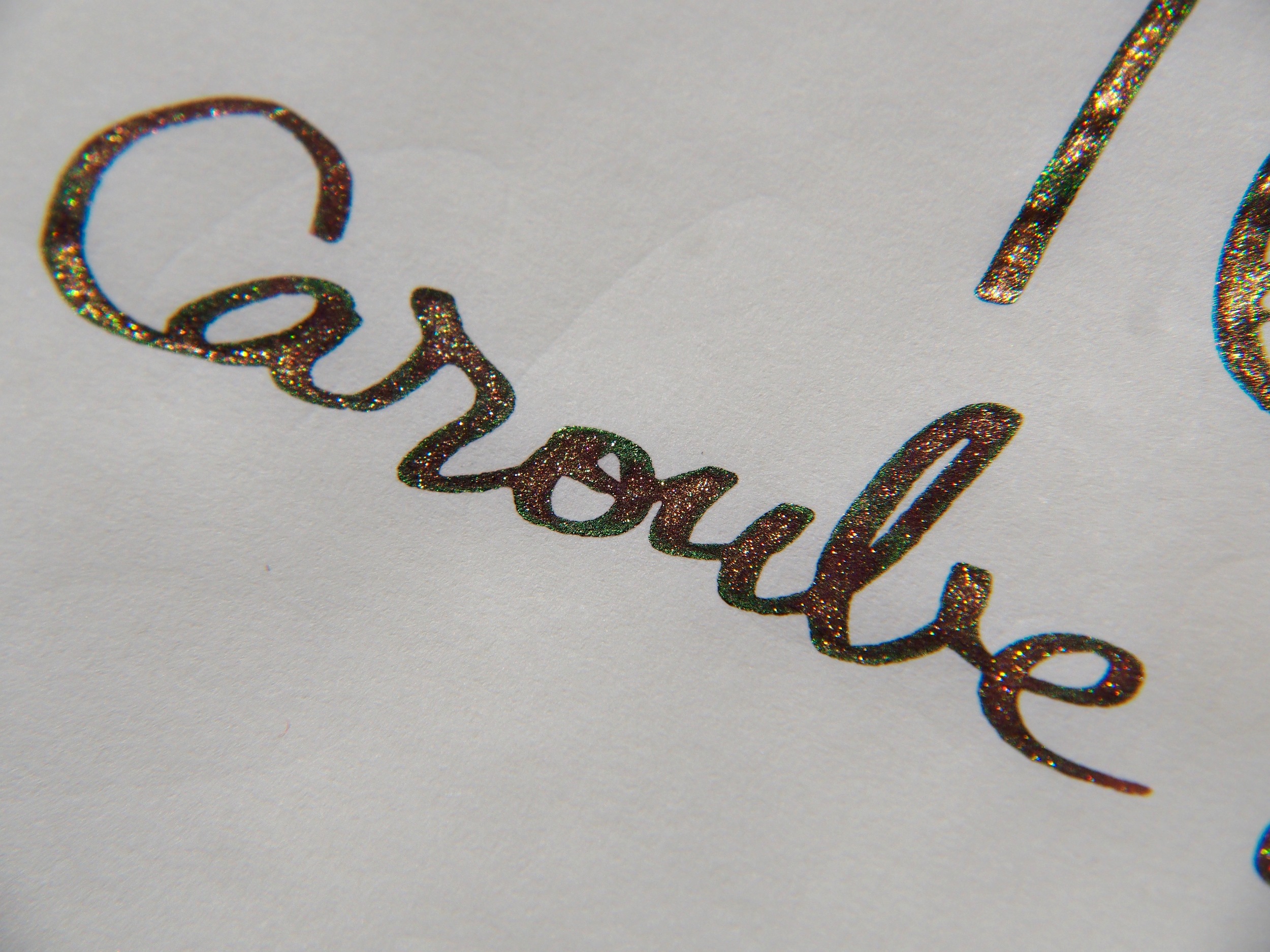
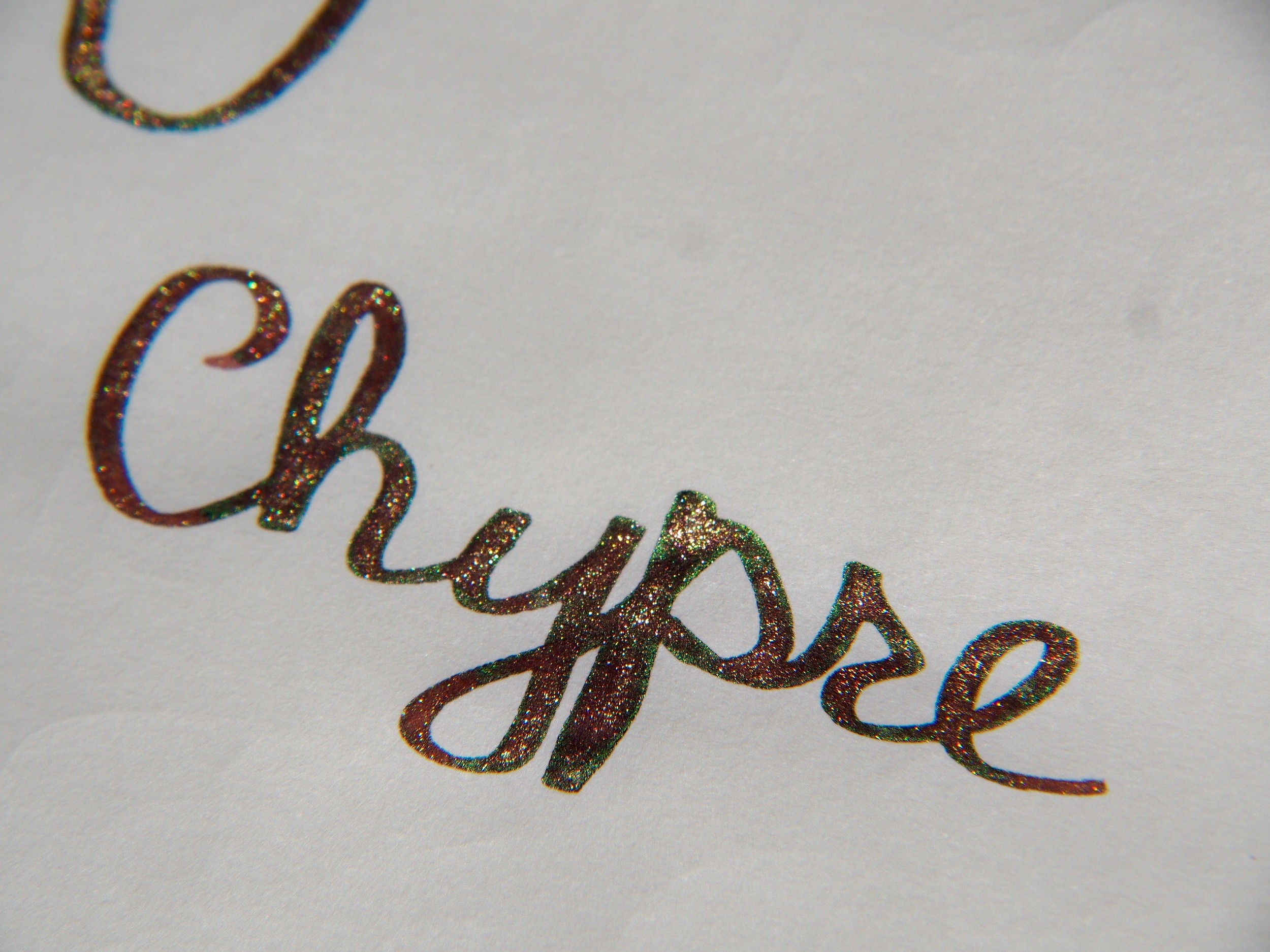
Very excited to receive this ink from Wonder Pens. This is a nice warm brown in the red side. J. Herbin did a good job creating a lubricated in. It's saturated and shades. The halo, sheen and sparkles show up more on Tomoe River Paper than Rhodia. At any rate, the ink behaves well. No feathering. Some ghosting and some bleeding if the ink goes down heavy. It's fun to make the lettering sparkly but that means constantly rotating and shaking then pen to keep up the flow of sparkles. The particles otherwise settle really fast. It's annoying in that respect. Otherwise, this is a fun ink to play with.
Additional Comments
The shimmer and sheen of the ink really depends several factors: paper, volume, lighting and settlement.
Paper
The ink feels smoother going down on TR paper than Rhodia. As well, the shimmer and sheen are much more prominent on TR paper. I can only see green haloing in TR.
On the Rhodia, the redness of the ink is more prominent. The ink appears less saturated and the intensity is muted. I can still get some shimmering, particularly earlier in a writing session.


Volume
Pressing down harder to flex the nib tends to lay down more ink and with that, more shimmer. Pooling of ink leads to beautiful shimmer and sheen.


Lighting
To really appreciate the beauty of this ink, one has to move the paper around. Looking at the page from different angles will bring out differing degrees of sheen and shimmer.


Settlement
By this I mean how much the sparkling particulates have settled. Giving the bottle a good shake is important to suspend the particles before filling. Even so, the sparkles settle extremely fast. I find that I can get more shimmer in the first few words. then I have to give the pen a gentle shake or roll it in my hands to resuspend the particles. This can be a hassle while writing. For this reason, I would only practically use it for special lettering projects or greeting card writing.


Closing Comments
So far I've enjoyed playing around with Caroube de Chypre. J. Herbin has managed to create another interesting ink that is generally well behaved. It has beautiful shimmer, shading and sheen.
The sparkles are gimmicky but fun. It adds an element of drama and surprise. Recently I've been introducing fountain pens to the 5 year old daughter of a family friend. She has been delighted by all the different pens and inks that I've been showing her. But when should found out that Caroube de Chypre has sparkles, she was head over heels excited. She couldn't get enough of it and added some Caroube to all her drawings.
What do you think of Caroube de Chypre so far? Will you add this to your ink collection and what would you use it for?


Pen: Kaweco Skyline Sport M
Ink: J. Herbin Larmes de Cassis (cartridges)
Paper: Pink Hand Decorated Notebook by Choosing Keeping